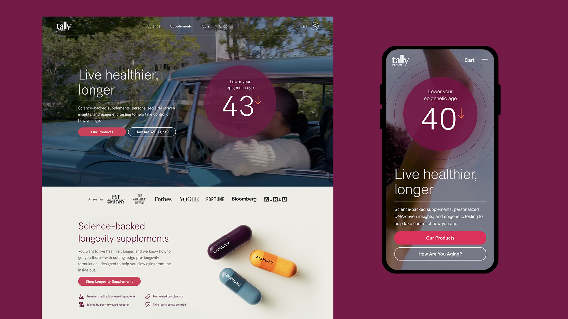
Tally Health is a consumer biotech startup in the longevity space. Their core product is an epigenetic age test based on a proprietary model analyzing DNA methylation patterns. The age test consists of a cheek swab which the user must self-administer then mail back to a lab for analysis. Their results are delivered on a web application, which also tracks past results and provides health recommendations. In addition to the age test, they offer multiple longevity-focused supplements to support healthy-aging, supported by peer-reviewed research conducted by an in-house science team. All of their products are sold on a subscription-based model.
My Role
In October 2023, I was recruited by Tally Health to lead all product-driven design efforts on their e-commerce site, membership app, and new growth initiatives. The goal was to reach and convert new audiences to subscribe to Tally Health's products and retain them over time. I worked closely with the Product Lead and Head of Product to identify areas of opportunity in alignment with the business direction. I then collaborated with the Engineering team to prototype, build, and ship product features to bring ideas to life.
Acquisition Quiz
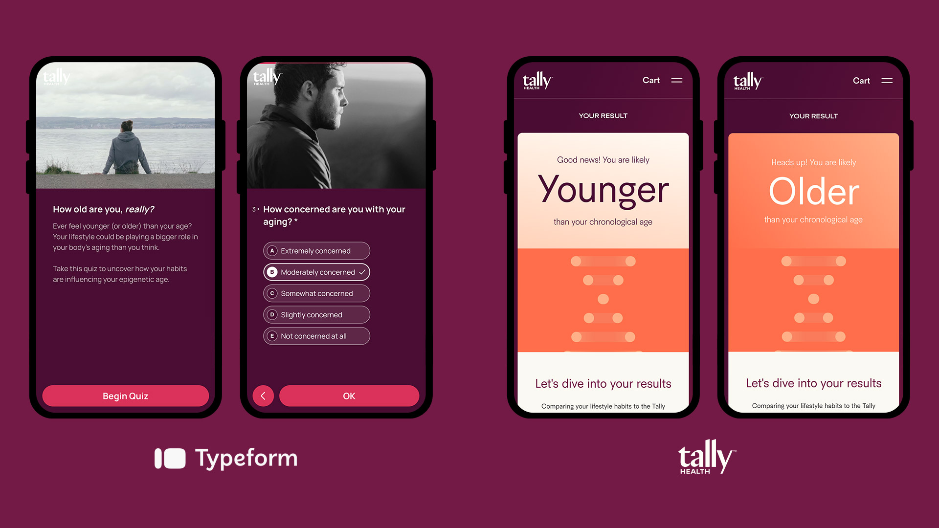
In Spring 2024 I designed the first iteration of a quiz meant to motivate potential customers to purchase an age test. I worked with the Science team to develop a simple health questionnaire that predicted if their “epigenetic age” might be older or younger than their “chronological age.” At the end was a call-to-action to purchase an age test and find out the real answer with a lab-tested result.
I designed the quiz to be adaptable and agile for different use cases. When the company pivoted towards a subscription-based supplement model, it was easy to alter the scoring system and design to drive sales for tailored supplement recommendations (e.g. Exercise, Sleep, Cognitive, Immunity).
Product Unbundling
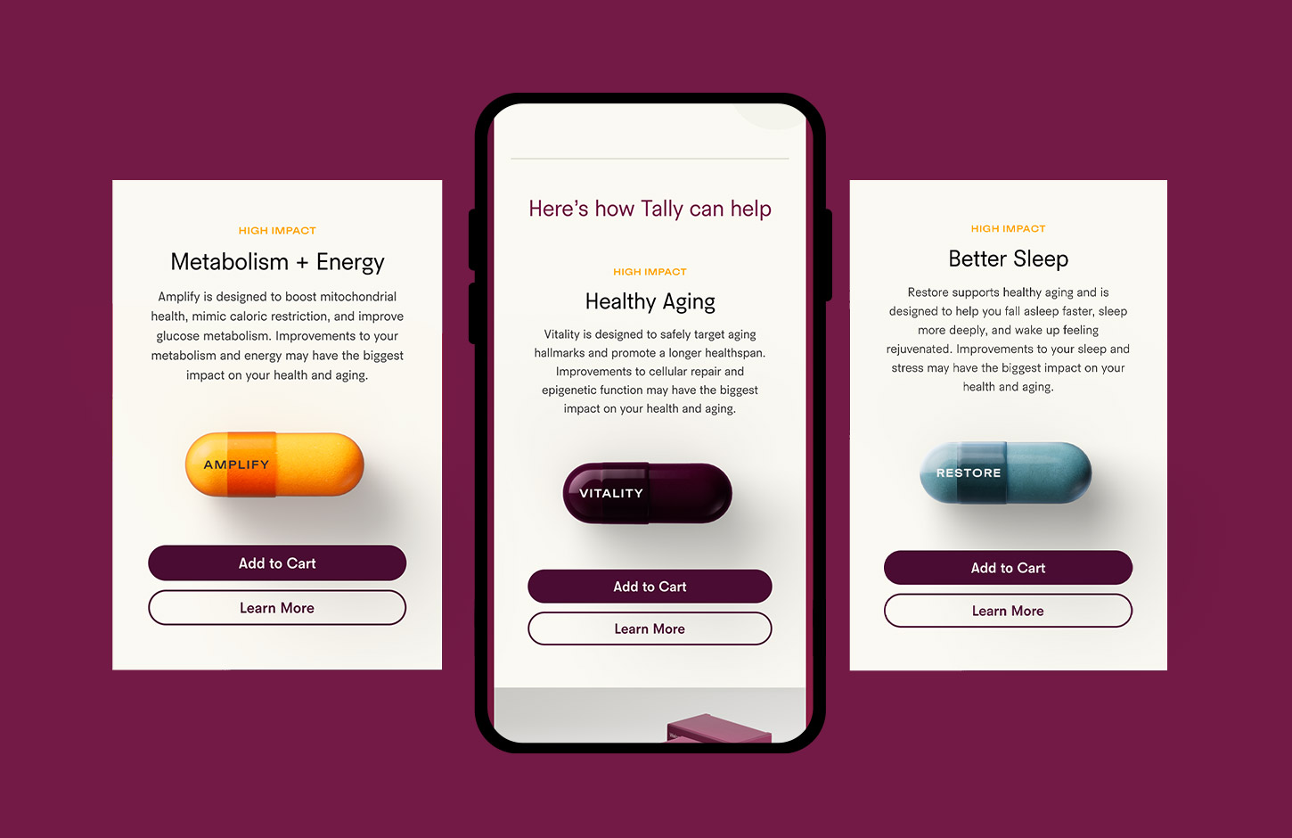
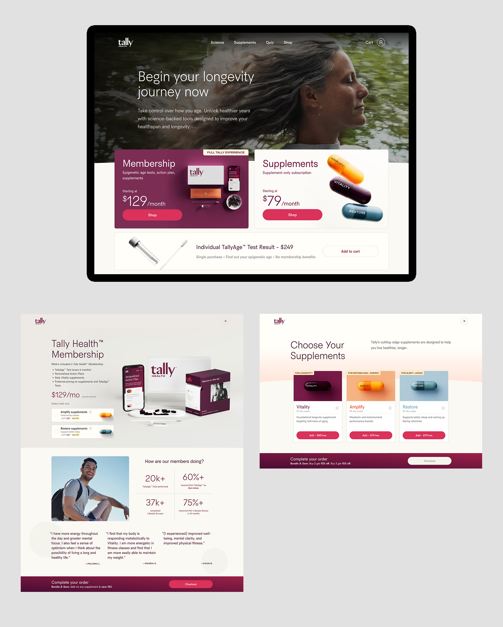
When Tally Health launched, they only offered one subscription that bounded the age test with monthly Vitality supplements. Later when they launched a new supplement, Amplify, it could only be purchased as an add-on. One of my first projects when I joined Tally Health was to allow users to subscribe to any supplement without needing to also subscribe to age testing.
Increasing Sales with Product Pages
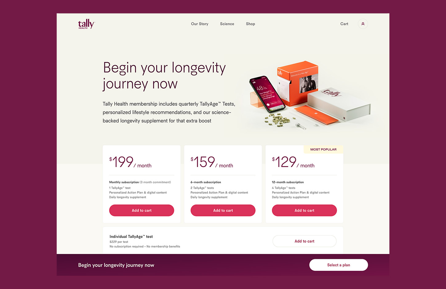
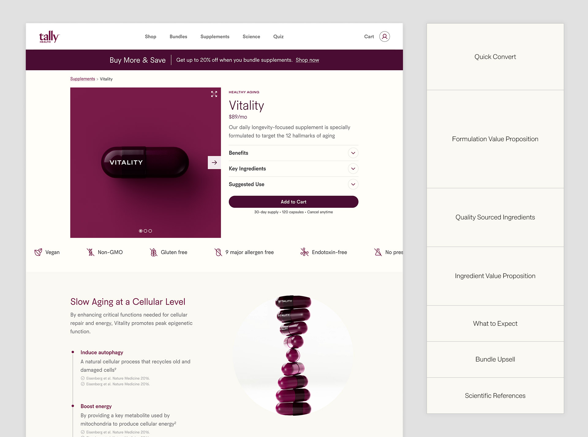
Tally’s initial purchasing funnel did not include product pages. Instead, information on each of Tally Health's supplements lived on disjointed one-off marketing landing pages intended for paid traffic. I designed Product Pages from scratch, to focus traffic through a single funnel and highlight the value proposition of each product to improve decision-making for users.
I was instrumental in defining the overall wireframe in how we should present information. While we didn't stray too far from best practices above-the-fold, I drove the focus on showcasing the value proposition of the formulation of each supplement above information specific to individual ingredients. We wanted to deter users from caring only about any single ingredient and purchasing that by itself from a different supplier.
Customizing User Controls
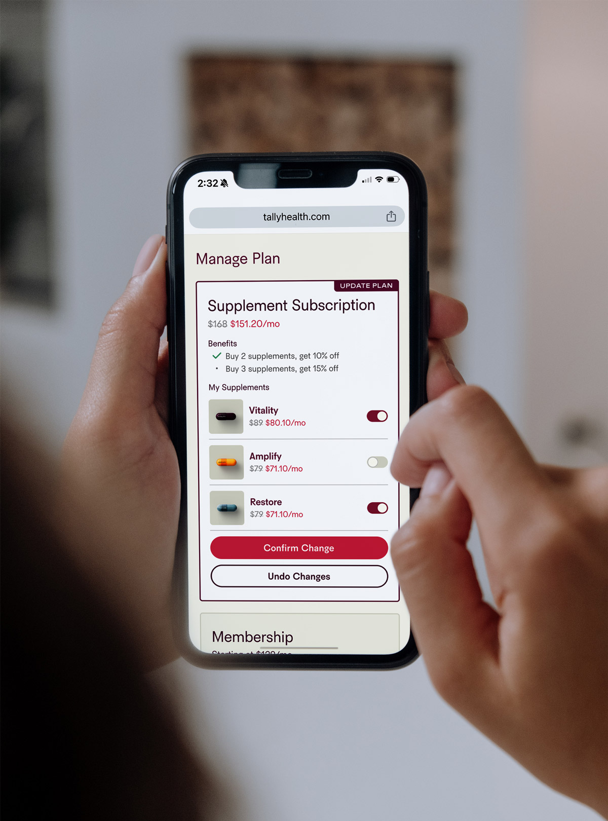
The Tally MVP used a Shopify plug-in for subscriptions that had a basic default UI for users to manage their account. It quickly fell short as more supplements and bundles were introduced. To give users more autonomy and improve the UX, I drove the designs for a custom UI to replace the default provided by the Shopify plug-in. Users are now able to more easily add and remove multiple supplements from their subscriptions within a single toggle experience.
Defining User Journeys
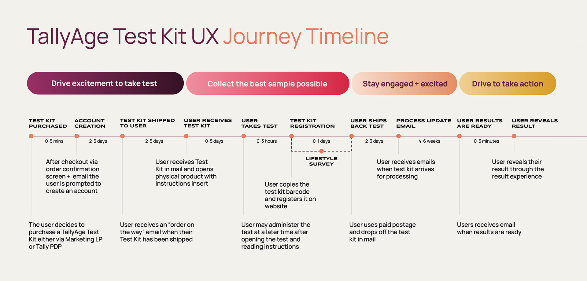
As we continually evaluated parts of our product experience I was responsible for mapping out user journeys to identify any gaps or present opportunities for new features. User journey maps took many different forms, from flowcharts in FigJam to infographic presentations, in an effort to clearly communicate strategies across the organization.
Building a Design System
Throughout my time at Tally Health as we tackled more and more projects in rapid succession, I began to develop a usable design system to help scale my efforts. This design system broke up several design elements across our storefront and Member Apps into re-usable components and templates.
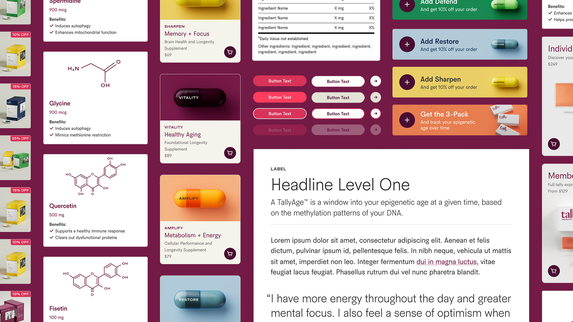
The design system was a living and breathing Figma file that was included as a library in every new design project. It allowed the design team to quickly spin up new projects and immediately have access to the latest designs, font definitions, and color library. As global design components get updated over time, it remains easy to update all projects with the latest changes quickly, consistently, and thoroughly.
The design system was instrumental in helping reduce the design dependencies for new supplement launches from over a month to just one week.