
December 13, 2016
Designing Refinery29 Channel Pages
A Better Way to Aggregate Content
As we transition Refinery29 towards a new site architecture, we seized a design opportunity to improve the workflow for our developers and editors – ultimately making the discovery of our content better for our users. This was the process behind designing our new Channel Pages.
Refinery29 is all about finding that new style you never thought you could pull off, learning that secret little beauty hack to get you out of a tricky situation, or stumbling upon that tiny piece of creative inspiration that motivated you to take on that weekend project you’ve been putting off. Our content is meant to be carefully curated, surprising, fresh, and yet easily discoverable. Being able to deliver that content to our users efficiently will always be one of our top priorities.
The relationship between our content creators and our platform is much like that of a fashion designer and the runway they send their clothes down. While there is no one perfect runway design for every single style, the ultimate goal is to provide a sustainable method to showcase each piece in its own light.
That’s how we try to approach designing the main vehicle for our content. From custom illustrations, powerful essays, original photography, to scripted video, our job is to develop a flexible — yet consistent — platform for all of our content to be discovered and seen.
When it comes to the design of our site, we want a content aggregation system that’s inclusive to the breadth of our content and empowering for our editors to shine a light on our most engaging stories.
The Focus on Channels
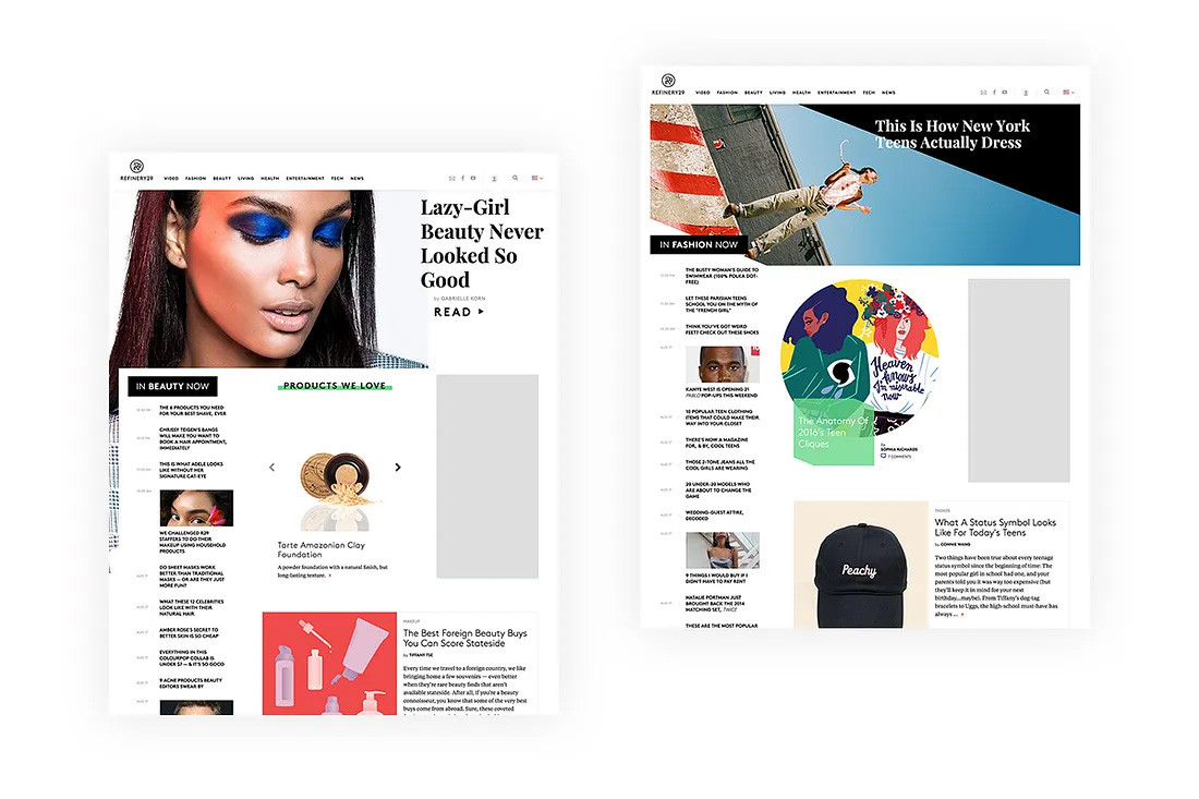
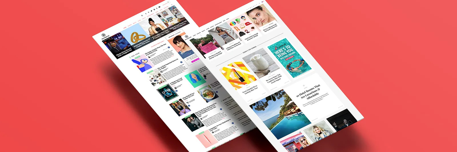
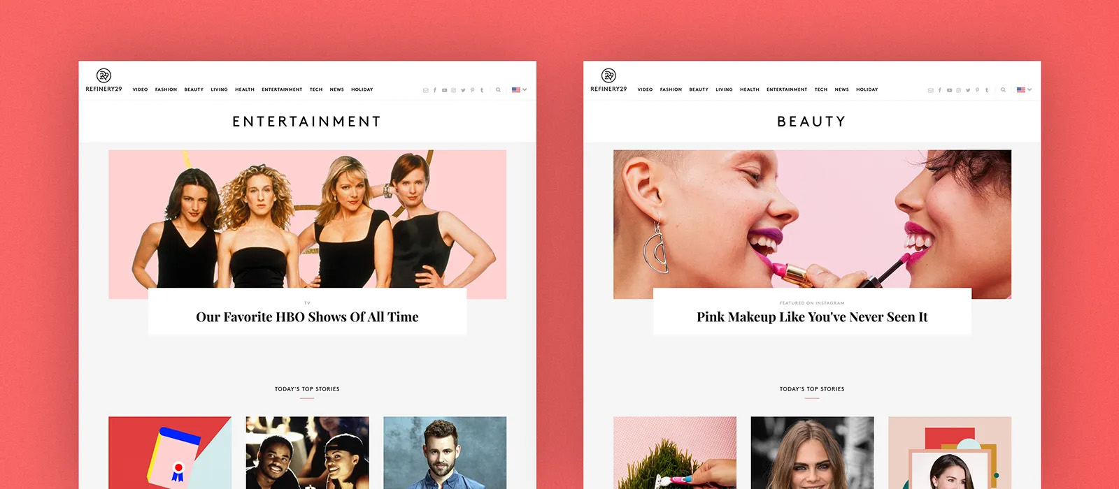
Refinery29 content is divided categorically into what we call Channels. We refer to a Channel as a place that lists any collection of published content around a common topic. A Channel could potentially be as niche as Korean Beauty to as big as the entirety of our content represented by our Homepage. Aside from our Homepage, some of our biggest channels are Fashion, Beauty, and Video.
While it’s important for us to establish patterns for how our users browse our content regardless of Channel, we also recognize the desire for different types of content to be displayed in different ways. For example, video content lends itself to a different visual format than written articles.
In the past, we only had a single template for top-level Channels represented in our main navigation. They contained a fixed design with a fixed number of stories, all manually populated by an editor. All other Channels had a list style card design that was automatically populated by a query in reverse chronology.
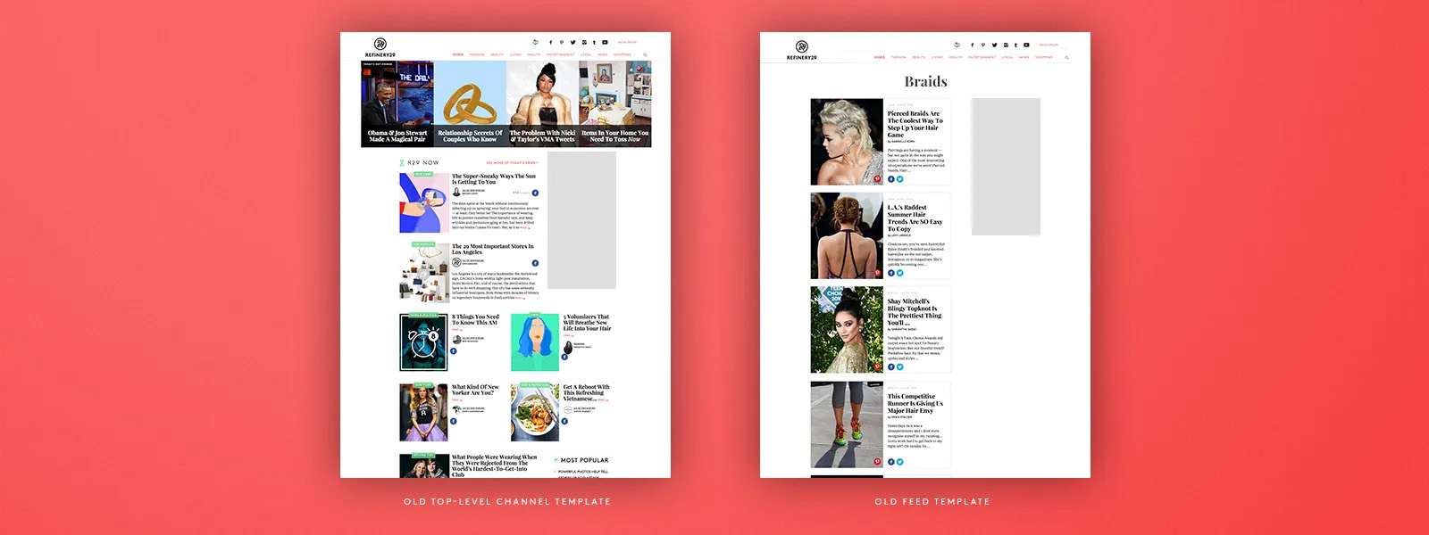
Furthermore for our top two Channels of Fashion and Beauty, we designed completely custom templates that each took 2+ months of dedicated engineering time to develop, test, and launch.
While these were premium ways to represent the Channels we stand strongly behind, they did not help us in the way of establishing a familiar reading pattern for our users. Not to mention each of these one-off undertakings took significant time from our developers to produce, making it unsustainable to scale.
A Predictable System
We wanted to design a predictable system with elements of variability. The overall goal being to streamline our site such that Channels can be auto-generated, yet easily customizable by an editor at any time, while also allowing us to maintain control over User Interface patterns we want to carefully set, test, and upgrade.
We used a wireframe card-based foundation — in your typical Lego-building workshop — to determine how we wanted our system to be constructed.
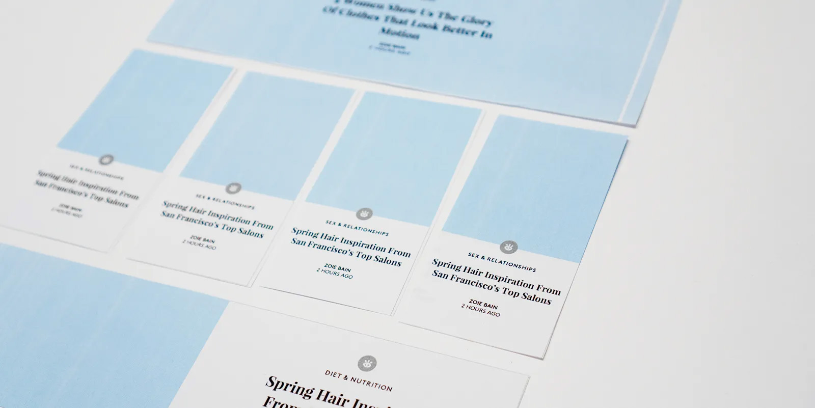
We looked at the specific use cases of our Homepage and Fashion channels, as well as low-touch, auto-generated Channels (created from our tagging functionality). We envisioned how these pages would potentially be built and rendered on various devices.
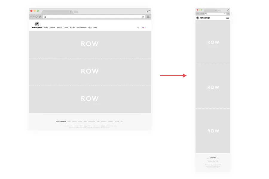
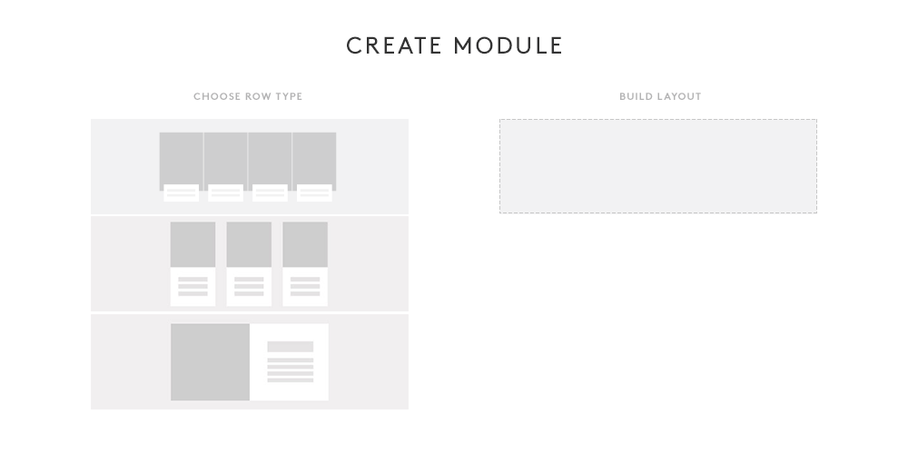
Building In Rows
From these workshopping sessions, we ultimately made the conscious decision to base our design system on a scaffolding of rows. What is a row exactly? For us, a row is just a pre-designed horizontal slice of the page.
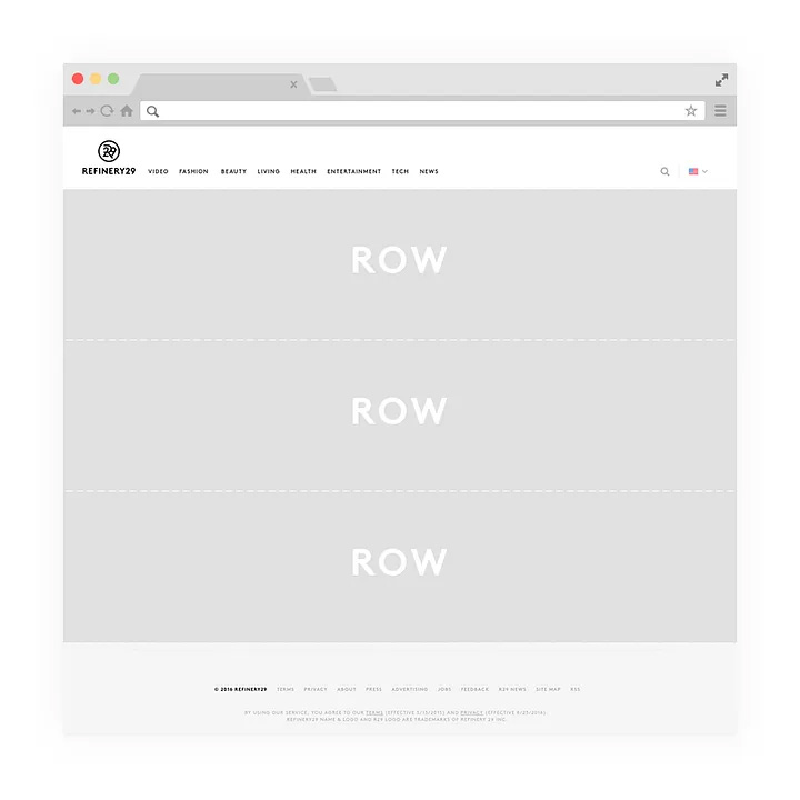
We would then offer our editors a variety of row types to choose from in order to build and customize their Channels. Being able to isolate our design into a limited pool of reusable row types is advantageous for us in maintaining and scaling our design patterns across site. It also gives us the ability to make our designs responsive in a predictable and bite-sized manner.
Instead of focusing on design compositions of individual pages as a whole, we decided to focus on designing individual blocks and the relationships between those blocks, which offers us the potential for an infinite amount of possibilities.
We decided to begin with three basic row types to start, with the intention of expanding our offering down the road to give our designs room to evolve.
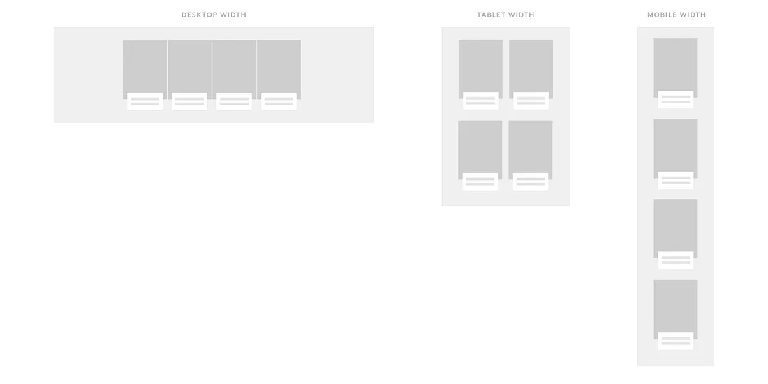
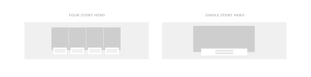
Four Story Hero
Our Four Story Hero is based on our highly effective classic hero style. We touched up the UI to aesthetically fit into a more logical system.
Three Standard Single Cards
Our Three Standard Single Cards row type is our base-level row type meant to display stories in a more dense manner, while still offering adequate space to showcase art and content.
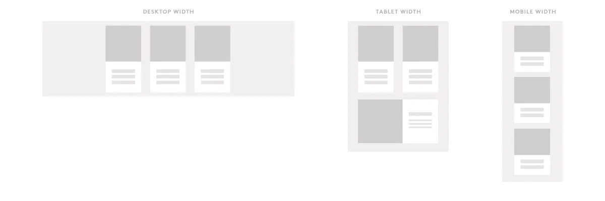
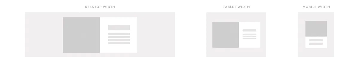
One Standard Full Card
Our One Standard Full Card row type is meant to give the page some breathing room, and also showcase bigger content pieces that we would like users to recognize.
A Quick Test
At this point we wanted to quickly test and see if our users would negatively react to a new card-based reading pattern before going any further in building out our system.
Using our proposed row types and initial card designs, we made a purely UI-only update to our Homepage and ran an A/B test to compare performance.
Here were a few metrics we wanted to keep our eyes on:
- Bounce Rate & Exit Rate — Will our new UI pattern turn people away?
- Scroll Depth — Our taller cards and bigger imagery will require more scrolling from our users. Will they put up with it?
- Clicks — Are we helping our users find content that interests them?
We wanted to make sure that we were going down the right path before we made a big investment in restructuring our entire front-end. The results were overwhelmingly positive.
Some key findings:
- The new UI reduced exit rate for returning users by 17%, it reduced exit rate for new users by 9%
- 28% increase in users scrolling to the bottom of the page.
Based on our findings we rolled out the visual update of our Homepage to 100% of our users.
Moving Onto Modules
In our system we established that row types would be used to build Modules. Modules allow our editors to curate custom clusters of content around specific sub-topics within their Channels.
In our custom CMS, we proposed a way for editors to have the ability to easily create Modules for Channel pages and modify the layout of those Modules using a build tool.
Each Module that’s created can be given a custom name to describe the content cluster. This name will be displayed automatically at the top of the Module in a default header style.
Modules can be created, deleted, and modified on the fly through our CMS. This gives our editors the ultimate flexibility in presenting their content without requiring the assistance of a single developer or designer.
Curation & Automation: The Balance of Power
It’s been shown that one of the most recognizable qualities of Refinery29 is our voice. This is largely due in part to our highly-curated content with a strong point-of-view.
Because our ability to curate is so important, much of the way we do things is very hands-on. This usually ends up being at odds with our desires to scale processes with technology.
In the past, we constantly created custom curated pages that quickly became stale if neglected. In rebuilding our system, we wanted smartly integrate the ability to curate alongside automatic population when it came to powering our Modules. We wanted to ensure that our editors could quickly promote stories and topics exactly where they saw fit, while making sure that content also stays fresh throughout time.
When an editor saves a layout for a Module using available row types, it is automatically numbered to show how stories will logically flow through the design.
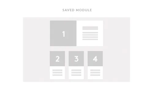
An editor must then choose a query (or tag) as a baseline to power the Module. The Module will now populate with a reverse chronological feed of stories tagged with the named query.
In our CMS we show the editor a list preview of stories that will occupy each numbered slot at the current time. The editor then has an option to search through our full database of stories and override any numbered slot in the Module. Manually inserting a story into a position will just shift over the stories already populated via query.
Offering this level of flexibility makes the process of creating new Channels effortless, curate-able, infinitely customizable, and easily manageable.
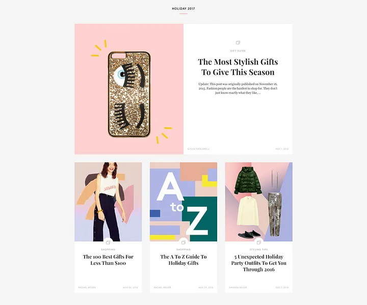 Example of a completed module — just in time for the holidays
Scaling For The Future
Now that the base of our system is in place, we can now focus our efforts on scale. This includes designing more row types, analyzing performance of existing row types, and seeing where incremental improvements can be made.
Soon after the initial launch of our new Channel pages, we released a new row type to be offered as an alternative to our Four Story Hero.
Adding diversity to our row types creates an additional dimension of individuality for our Channel pages. Although we can add an endless variety row types to our available pool, we are still exercising discipline in deciding what justifies additional styles of row types.
We don’t want to add a plethora of styles for row types merely for aesthetic variety. It could easily detract from our visual consistency and dilute the visual hierarchy we’ve established. When implementing a new row type, it’s based purely on if it adds value to the content browsing experience.
The Test Of Time
Over time, we will be looking deeper into how our users enjoy discovering our content, and constantly figuring out how to optimize the experience. Having our Channel pages designed with this new structure will allow us to be more nimble when it comes to testing and observing the performance of our designs. Our plan is to continually try and test a variety of row types, as well as module compositions to find the best browsing habits.
Now that we have a solid foundation in place we can move a lot more quickly and effectively to implement design changes at scale.
We’re excited to see how our Channel pages can evolve moving forward.
Special thanks to everyone who had a hand throughout the entire project:
- Product & Design — Emily Hengemihle, Nicole Pikulin, Aziz Hasan, Frank Conway
- Engineering, Development & Testing — Daniel Habib, Ryan Catlin, Chris Sloop, Carlo Francisco, Patty Delgado, Jake McGraw, Jen Calloway, Josip Herceg, Melissa Bulzomi, Cara Warner, Ming Hou, Graham Daniels, Jing Flint, Rachel Shatkin, Jennifer Refat, Claudia Sosa.
Leave a Comment