
February 1, 2016
Designing Refinery29’s First Mobile App
How an editorially-driven concept became an opportunity for Refinery29’s first mobile app.
At innovative companies, we encourage anyone with an idea to pursue it. As peers, it’s our jobs to empower each other with the tools to help make those ideas reality. That’s how a story about an 87 year-old woman who fell in love with raver clothes was made. It’s also how we found ourselves with feet on the ground in Turkey and produced a heartfelt feature following the lives of 3 Syrian Refugee women. It’s no surprise that when Ben Wilson and Juan Sanchez started working on a mobile app on their own time, we rallied behind them as a team to make it come to life.
Brand new endeavors always bring the greatest learning experiences. Pushing a new mobile app concept through our design process was no exception. This is just an inside look on how it all went down.
Identifying the Opportunities
Many big media companies hit the app store strong last year, while others abandoned apps. We knew we wanted another touchpoint for our audience, and we wanted a thoughtful one.
Sounds pretty straight forward, right? Not exactly.
Our fans are already engaging with us across several apps on their phones like Facebook, Snapchat, Twitter, Apple News, and Google Play Newsstand to name a few. We wanted to pinpoint exactly where the opportunity would be for us with content within our own app.
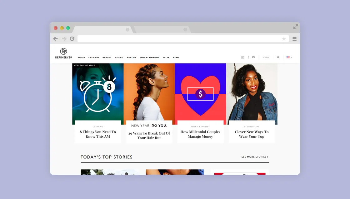
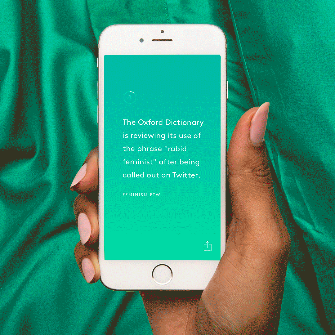
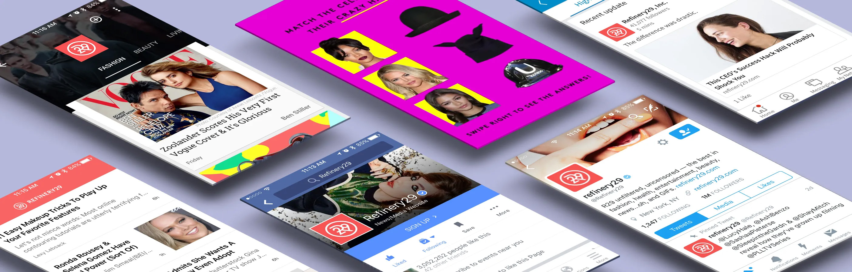 The different ways Refinery29 already exists in app form
Before doing any design whatsoever it was important for us to gather some feedback that could get us in the right direction for our overall experience. Although we had our own thoughts as to what might make for a great app, it was paramount for us to find out what our users were saying first.
We narrowed down our opportunities based on an analysis of our content across all channels, coupled with regular user testing sessions led by Amelia Kruse. When it comes to user-centered design our goal is always to deliver on what our users show they actually want, and not just what we want for ourselves.
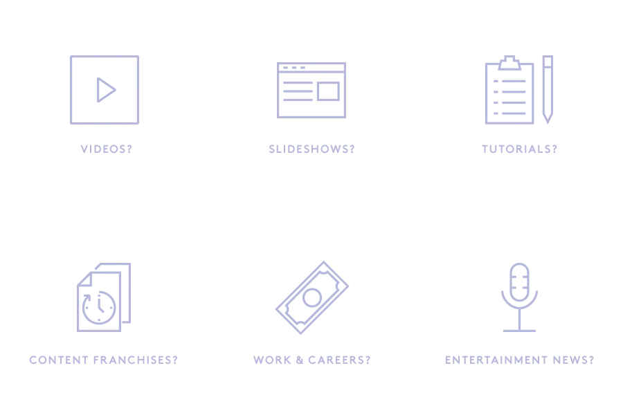
In our data and in our conversations with our editorial team, we identified several content series and content types that were performing across our .com and social channels. These were the types of things we looked at:
In our user tests we tried our best to ask non-leading questions like:
- What apps do you currently have on your phone?
- Why would you NOT delete an app if you ran out of memory?
- Why do you read Refinery29?
- What do you believe Refinery29 is an authority in?
- What would you expect from Refinery29 if we were to create an app?
What did we find? Here were just some of the themes we were able to extract:
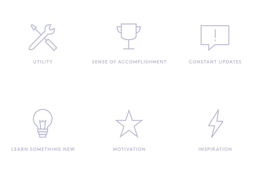
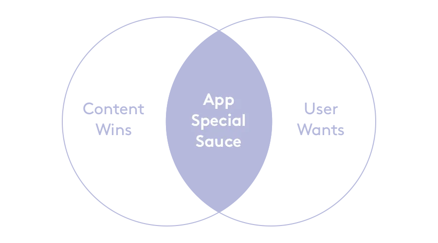
Our point-of-view was that somewhere in the intersection of our content wins and our user wants would be the special sauce for an app concept.
Choosing a Candidate
Taking all of this into account, we had an obvious frontrunner. 8 Things You Need to Know This AM (abbreviated as This AM) is a daily maintained content franchise where we publish 8 of the most interesting things that we think you should know before you start your day. It’s a proven lightweight way to resurface and reframe content for our users in a more meaningful context.
 Every morning 8 Things You Need To Know This AM was pushed to the top spot of our hero.
Every morning 8 Things You Need To Know This AM was pushed to the top spot of our hero. It hit a lot of the points that we identified were important to our users in our initial testing. It had a level of utility, it was constantly updated, and it was educational. It also was a series we found to be popular onsite and on Facebook. Every morning This AM held the first spot in our hero, with a short accompanying text-based video optimized for the Facebook Feed.
Early on we enlisted the help of Jessica Chou, the dedicated editor who would support writing content for the app. We had ongoing conversations with her on how she was currently writing This AM articles at the time, and how we could best optimize it as part of a mobile experience. We went through several exercises of cramming various lengths of content on to various screen sizes. Nailing down the content expectations was essential in guiding the rest of our design decisions.
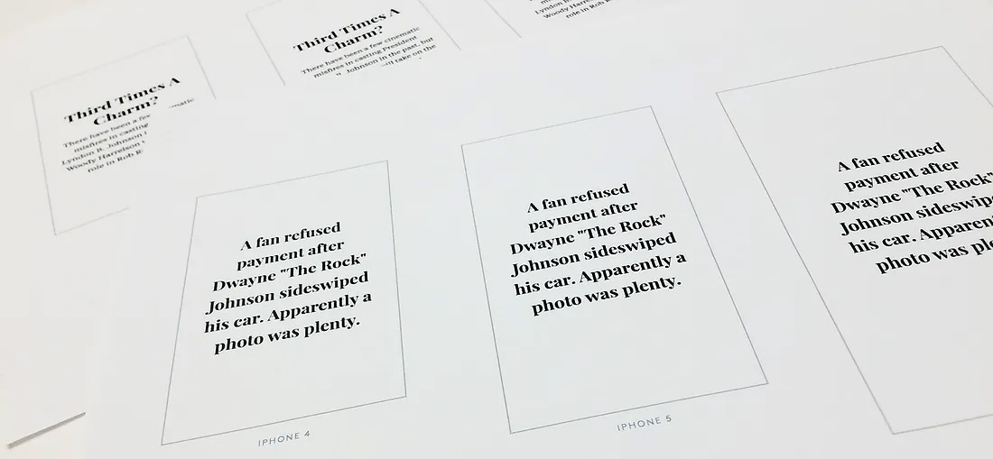 We experimented with different lengths of content along with type hierarchy to decide what would make the best experience.
We experimented with different lengths of content along with type hierarchy to decide what would make the best experience.
We also found out from many of our users that they were aware of their habit-forming usage of apps. They were able to identify specific daily moments and routines where they would use specific apps. This AM presented a unique opportunity in that we could potentially make it a staple in our users’ morning routines. We continued to investigate on this aspect with user testing as we got the wheels turning on the design.
Priming The Experience
When we go into designing any experience we often rank our priorities of what we want our product to accomplish. It helps establish the foundation for visual hierarchy and guides decision-making. We do this several times throughout the process to ground ourselves on what is most important and what could take a backseat. It also helps us establish some Key Performance Indicators (KPIs) to measure what we might consider a success.
Here’s just an example of what we thought were important gauges:
- Repeat App Opens — Above everything we wanted to give our users a reason to return to the app, opening it on a consistent basis regardless of what they did inside.
- Completion Rate — Get the user through as many of the 8 things as possible, if not all.
- Click throughs — Allowing users to take action and consume a story, in turn generating a web view.
- Shares — Get the user to share stories from the app
In addition to setting our priorities, we wanted to create a consistent experience, so its use can quickly become intuitive. To do this we maintained two basic gesture principles from the start:
- Swipes in a single direction for the 8 things
- Taps to access deeper content
Lastly, we had a strong point-of-view on ending the experience with a moment of delight for the user. This aspect was actually very important, to either counter-balance days with heavy news, or compliment days with light-hearted news. We dedicated space at the end for some type of thoughtfully placed animated GIF to be inserted to close out the experience.
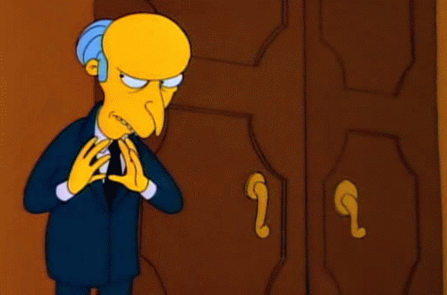 Mr. Burns via Giphy
Crafting The Experience
We wanted to start getting this in users hands as soon as possible and get feedback to make sure we were creating the right experience. We tried our best to not get too caught up in visual aesthetic too early on in the process to allow for better top-level design decision-making. We started whipping up rough compositions and threw them into prototypes right away using various tools in increasing levels of fidelity.
Initially we used InVision to start getting reads on usage patterns. We then spun up an HTML/CSS prototype to test deeper, less controlled interactions that previously couldn’t be achieved. Simultaneously, a rough version was already being developed in ReactJS by Ben Wilson, Emily O’Brien, and Ilana Sufrin, to investigate what our capabilities and limitations were in terms of our proposed designs.
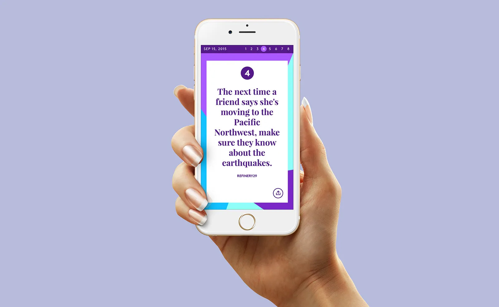 An early version of what we had built
These early prototypes were put into users hands in regularly scheduled user testing sessions, which allowed us to catch design issues early on and fine tweak some details.
User-testing also allowed us to physically compare different UI patterns like up/down vs left/right swipes, decide the best transition for the web view, identify points of friction, and see if anything appeared too confusing to the user.
Painting The Experience
Once we locked down the core experience, we then started focusing on the art direction and nitty-gritty visual design elements. Throughout the entire design process we actually went through several facelifts, which is not uncommon especially for a company that puts so much emphasis on aesthetic.
The visual design of the app went through many different facelifts throughout production, while keeping the core UX and UI principles the same.
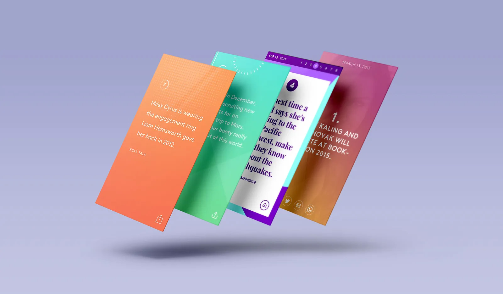 The visual design of the app went through many different facelifts throughout production, while keeping the core UX and UI principles the same.
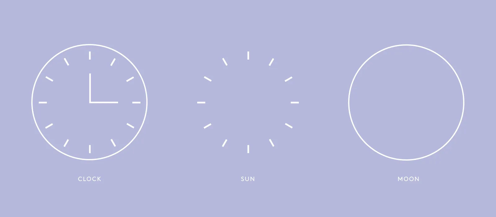
Led by Kate Titus, we landed on a beautiful minimalist concept based on the deconstruction of a clock transforming into a sun and moon. Additionally we found opportunities for UI elements to become part of the branding. For example, our progress indicator became a color-changing background reminiscent of a sunset.
Using our HTML/CSS prototype we continued to fill out our vision for the visual design and fine tuned the experience of the app. It was also used as a constantly updated tool to guide the development of the design as it was broken up into sprints.
During this process we also were able to jump onto some unforeseen opportunities. As we were playing with the experience in our prototypes and applying the art direction, we thought it would be cool to do something a little more custom for the end GIF. Rather than plainly dropping any old GIF in, an idea was born to do custom drawn line art animations that encapsulated a variety of emotions to compliment the news of the day.
We got the help of Isabel Castillo from our Design team to concept out the artwork, and Caitie Thornton from our Video team to animate them out. We were extremely happy with how this idea played out.
 For the heavy news days
 A generic option for more light-hearted news days
These are only a couple. You’ll need to check the app everyday to see the rest :)
Minimum Viable Product (MVP) and Beyond
It’s really easy to over design a product before even getting it out the door. When it came to our vision, of course we wanted all of the bells and whistles, much of which could be argued as non-essential to the primary function of the app. For this reason we decided to fork off a separate prototype, stripping out pieces we felt were unnecessary for launch. It also allowed us to set realistic expectations for our deadlines and milestones.
We kept an inventory of what we removed and set them up on a roadmap to be implemented in future updates (so stay updated and stay tuned!).
As the app begins to roll out in the App Store we will continue to track its actual usage as well as gather user feedback. Design is never done, so we plan on constantly iterating on This AM based on data and hopefully see how it evolves.
In the meantime, go check it out and give it a whirl. Feel free to let us know what you think!
This article was published in 2016 when the app launched. Since then Refinery29 has undergone a few management changes and the app is no longer available for download.
Leave a Comment